How do you modernize a 200-year old farm to give it life in the 21st century?
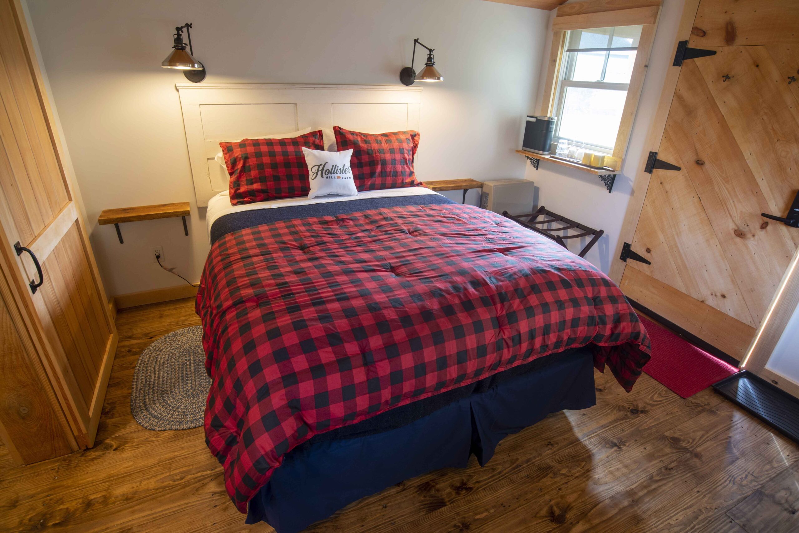
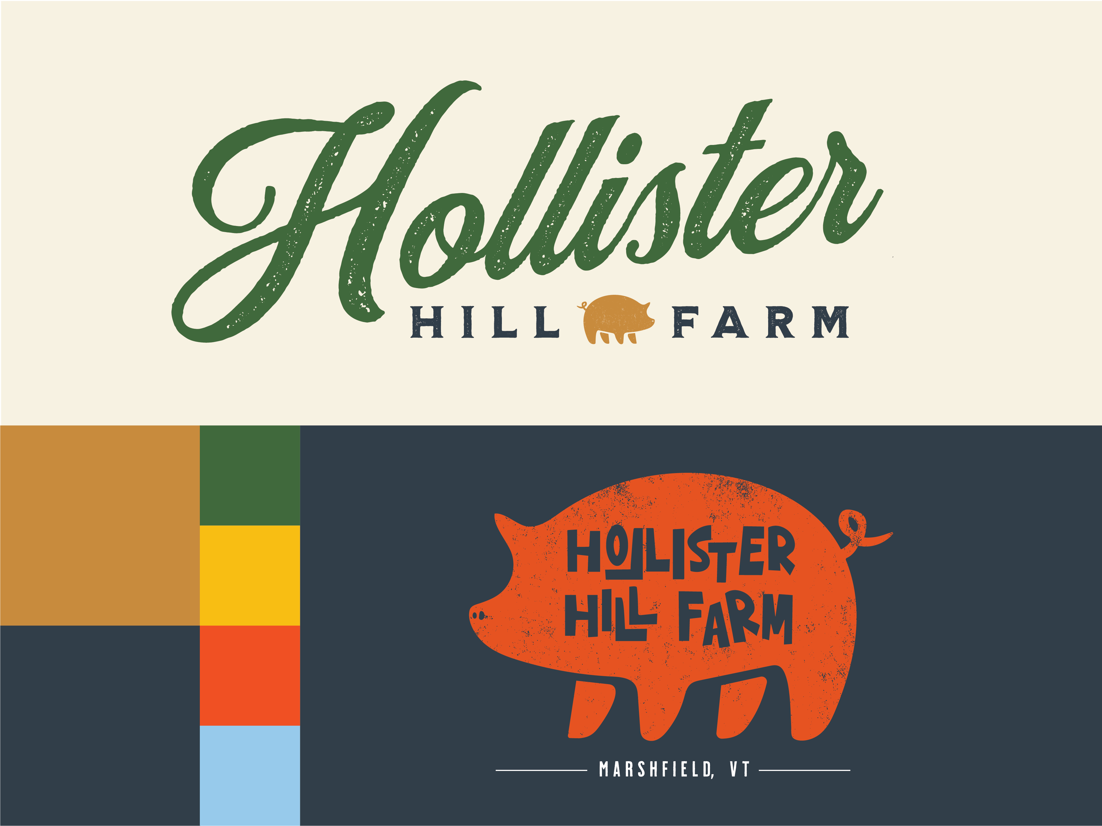
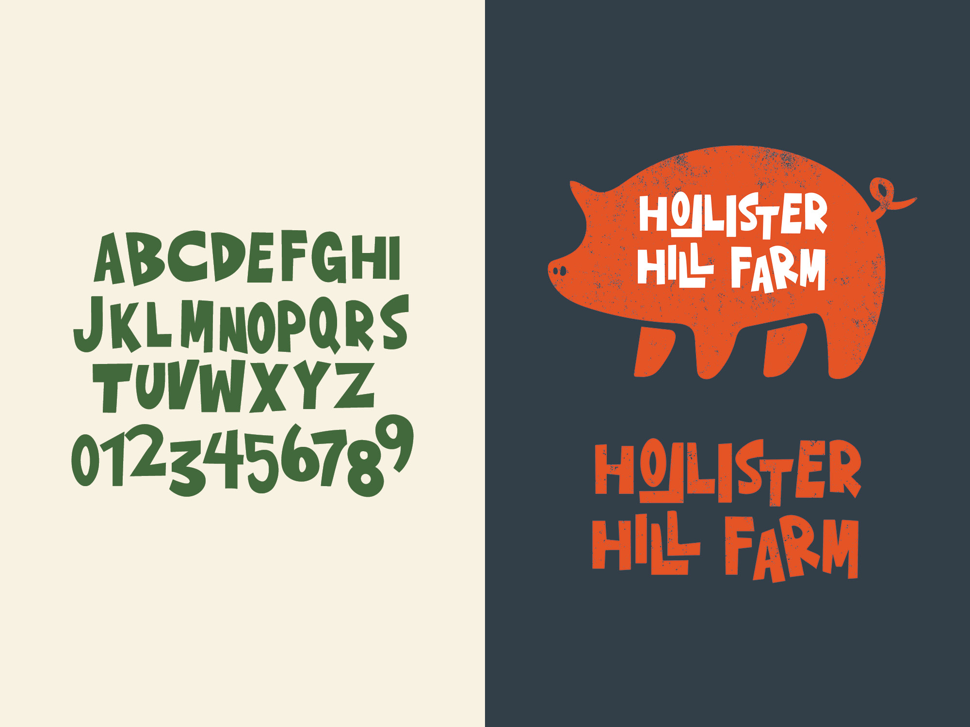
Hollister Hill Farm is a family-owned farm, store, and B&B located in Vermont. In need of branding and a better online presence for their services and food products, Brevity & Wit, a strategy and design firm I create with, worked collaboratively with Hollister Hill Farm to produce a new logo and visual identity guidelines. Inspired by a piglet squealing in the background of our first kickoff call, the logo features a pig as its primary symbol, but alternates per event, service, or product.
Lead Designer: Sophia Greenbaum
Developer: Todd Zeldin


The process of transforming Hollister Hill Farm:
In 2020, the Dunlop family transitioned to becoming the farm's new owners and caretakers. Given this, we created a visual identity that would allow them to explore who they are as new farm owners, while growing and upgrading the B&B and store.
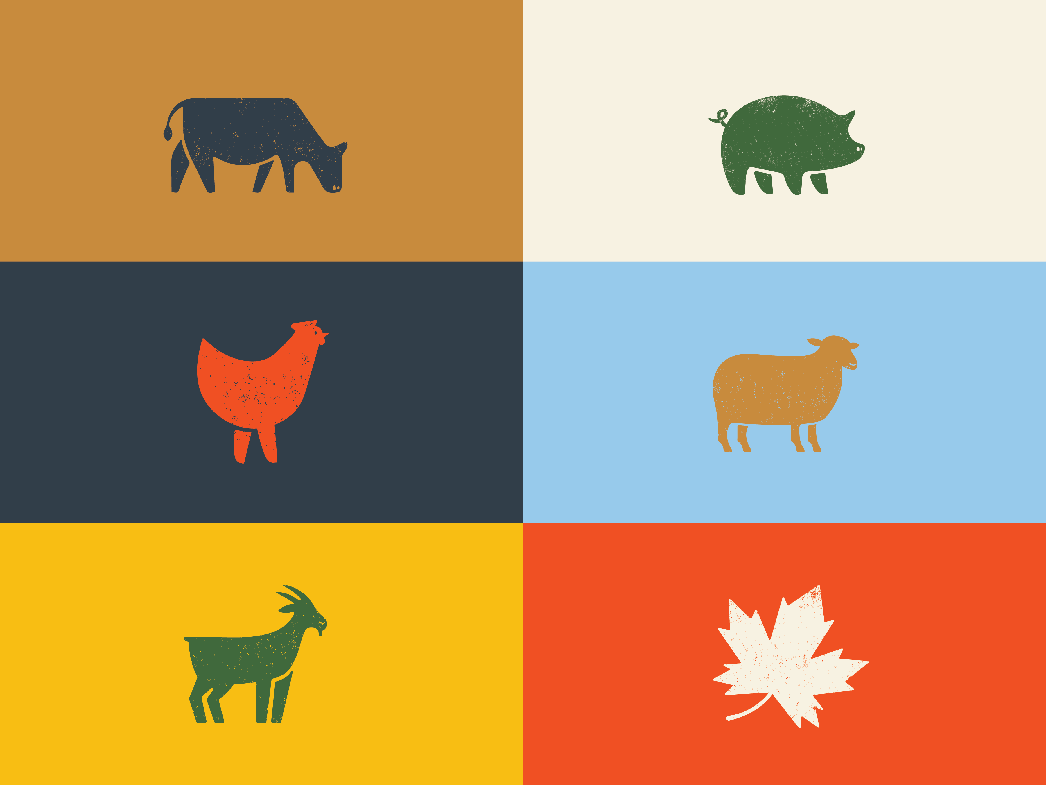
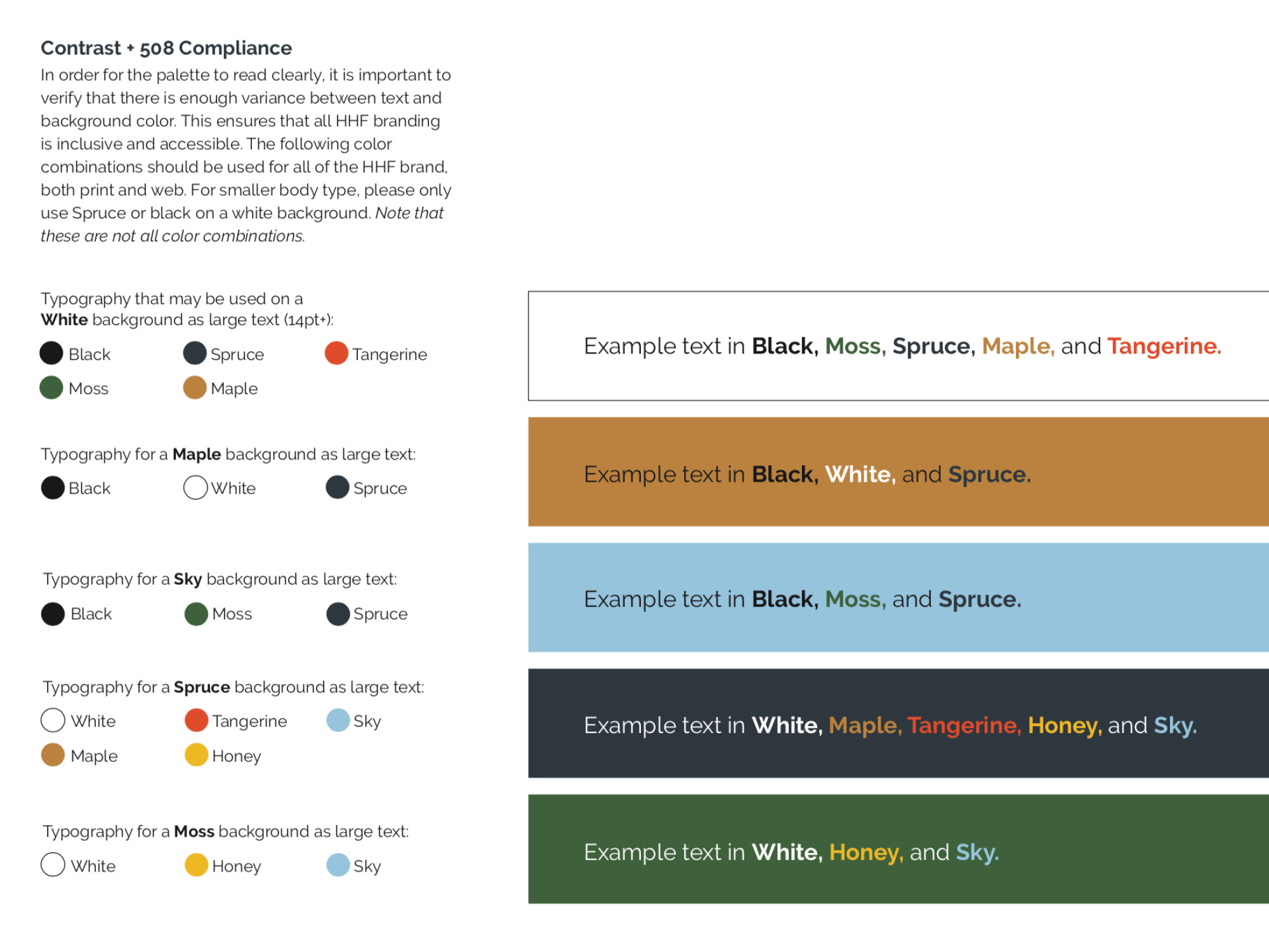
Hollister Hill Farm needed to have flexibility—and fun—within their brand given the several products and services offered at the farm. So I set up a visually accessible (508 compliant) design system with interchangeable icons and custom illustrated typography for merchandise and supporting graphics.
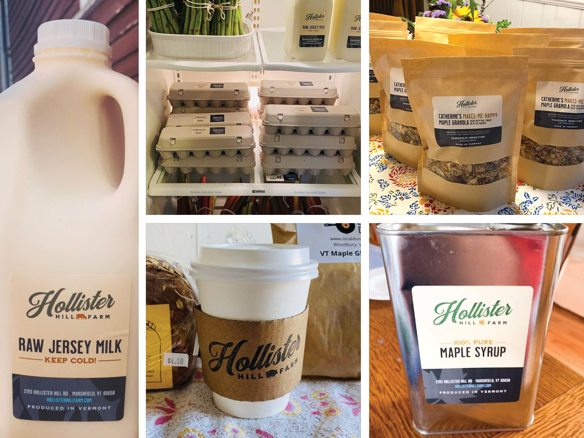
As the farm continues to grow both physically and digitally, Hollister Hill Farm's new identity takes on a life of its own across the many facades of its food labels, signage, and refreshed website.
Photos courtesy of Hollister Hill Farm.
The deliverables:
In order to accomplish Hollister Hill Farm’s rebranding, the following activities were pursued:
Visual identity creation: Developing a visual identity that included a new logo, brand guide, colors and typography, icons, and labels.
Print and digital collateral: Creating various product labels for print, designing signs as large as 18' in length, and building graphics for email and social campaigns.
Web design and development: Redesigning, redeveloping, and relaunching the Hollister Hill Farm website to be aligned with the new ownership and visual identity.
