How do you make an IT and cybersecurity company stand out from the competition?
In a world that lives in a digital age, how does one choose the best protection from online threats? How does a business ensure that its online systems are running optimally? How can an organization hire a top-tier IT and cybersecurity company to manage its technology with so many options?
These were a handful of the questions discussed in a visual identity reboot for Aligned Technology Solutions, an IT and cybersecurity company. In partnership with Brevity & Wit (a strategy and design firm I create with), I led Aligned through a branding overhaul, which included a new visual identity and implementation of that identity into a cutting-edge website.
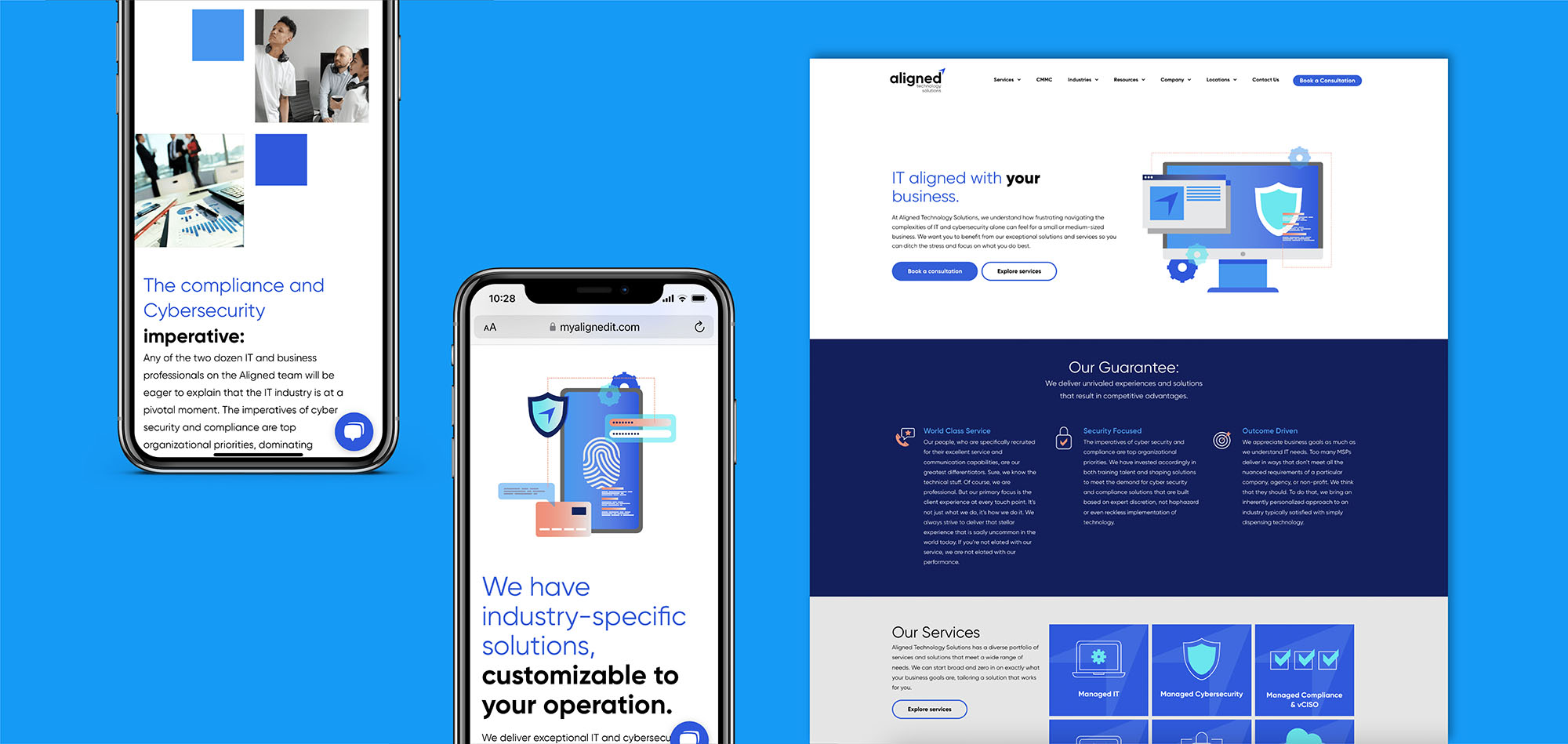
The website needed to be unique to the competition. It needed to be less masculine, avoidant of the typical fiber-optic stock photos, and revealing of Aligned's thought leadership. This was achieved by designing visually accessible (508 compliant) branding that was brought to life on their website, which was developed by Digital by Jess.
Lead Designer: Sophia Greenbaum
Creative Director: Acacia Betancourt
Developer: Digital by Jess
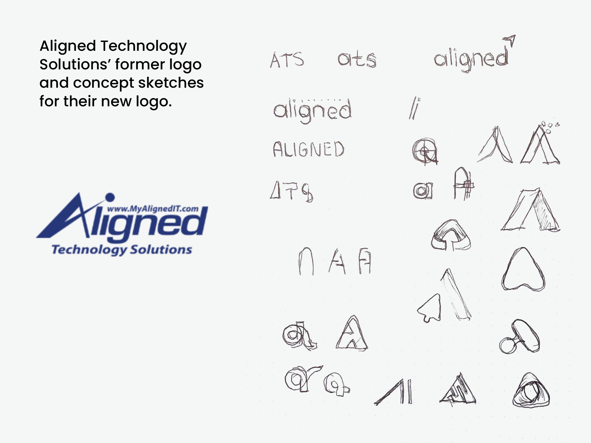
The process of transforming Aligned Technology Solutions:
The objective of the new visual identity was use it as a digital tool to attract more leads, particularly through the website. Since the website launched in September 2021, website traffic increased by 200% and page views per session increased by 47% in its first two months. Session length increased by 72%, with the average visit lasting more than two minutes.
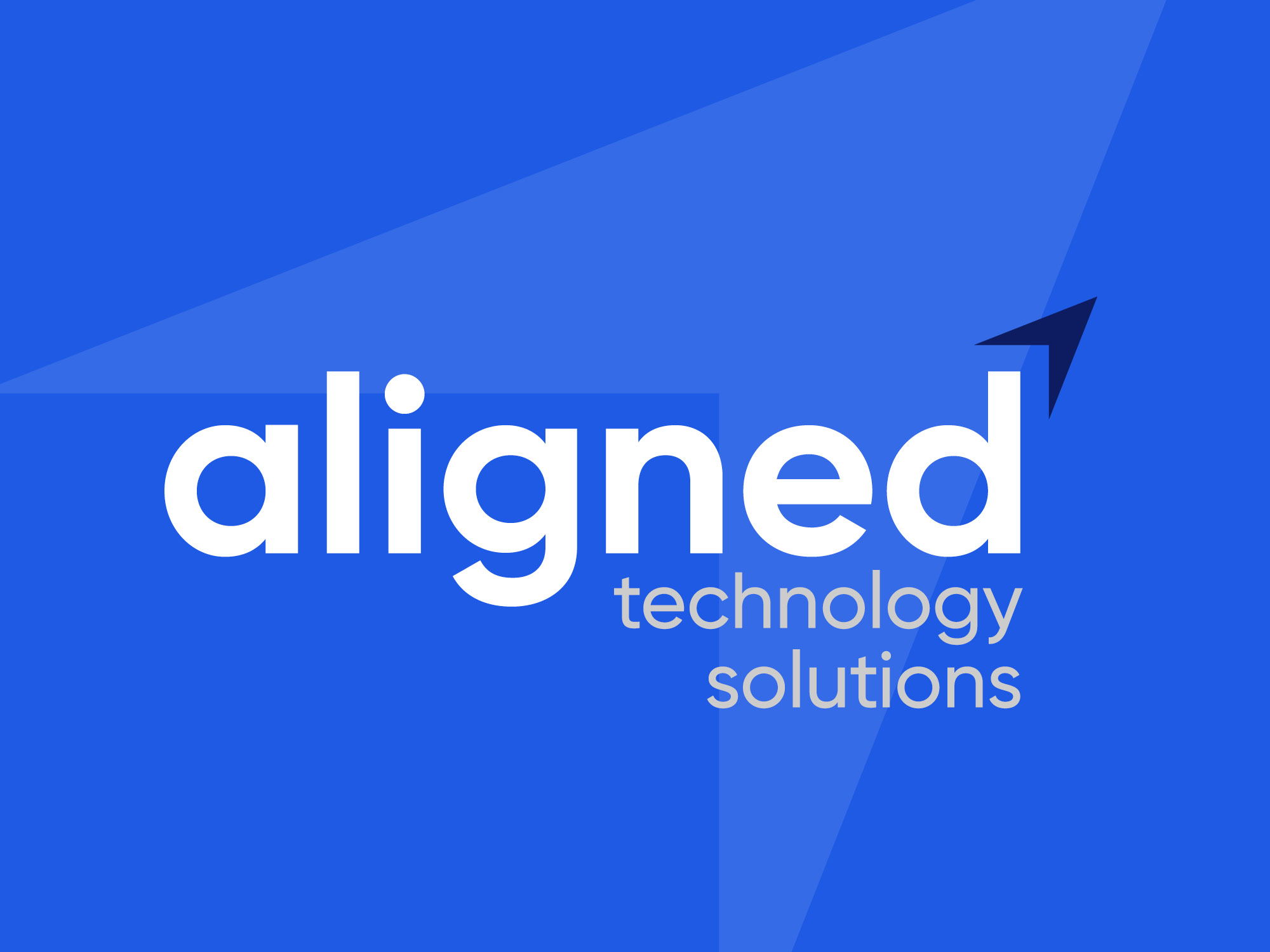
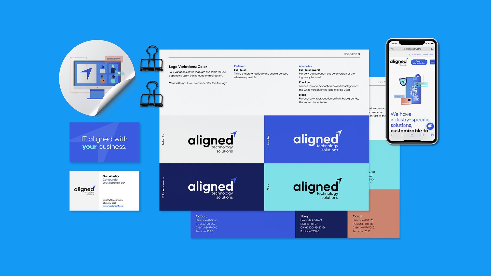
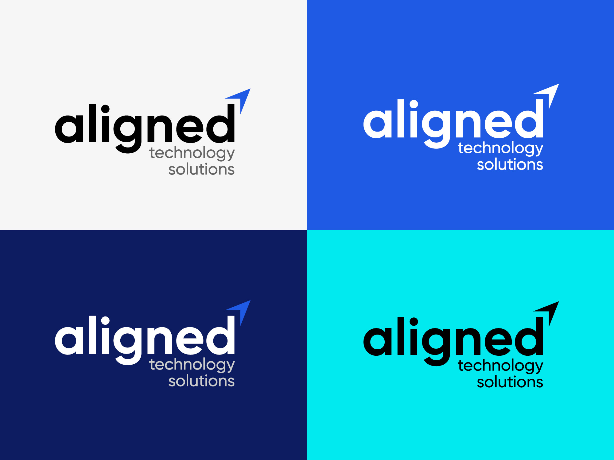
Since Aligned is a web-based company, its refreshed brand needed to be clean, bold, and minimal, making it easy to read across various digital platforms. When I began conceptualizing the new logo, only one graphic element within the logo — perhaps the A or a cursor graphic — was emphasized to achieve this. The final logo (as pictured above) depicts a cursor in the form of an abstract letter A, with its placement in the logo indicative of movement forward and advancement.
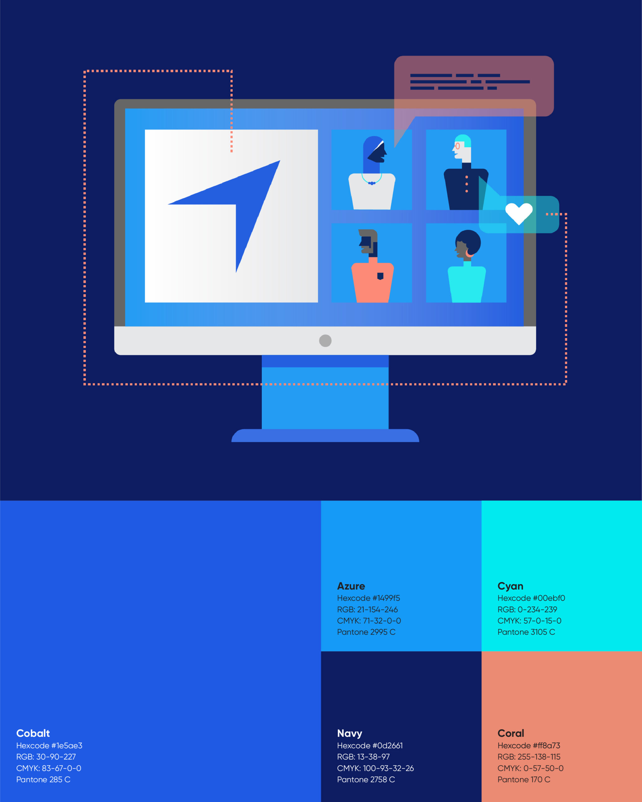
In order soften Aligned's former brand, it was critical to revise the company's color scheme. While the multiple selected blues are essential as they are representative of trust and intelligence, white and a coral were introduced to balance the color scheme and to make the brand less masculine. This broadens the appeal of the brand to a wider audience, thus generating more leads on the website. The new color scheme of the website passes 508 compliance standards and is accessible to users with low vision.
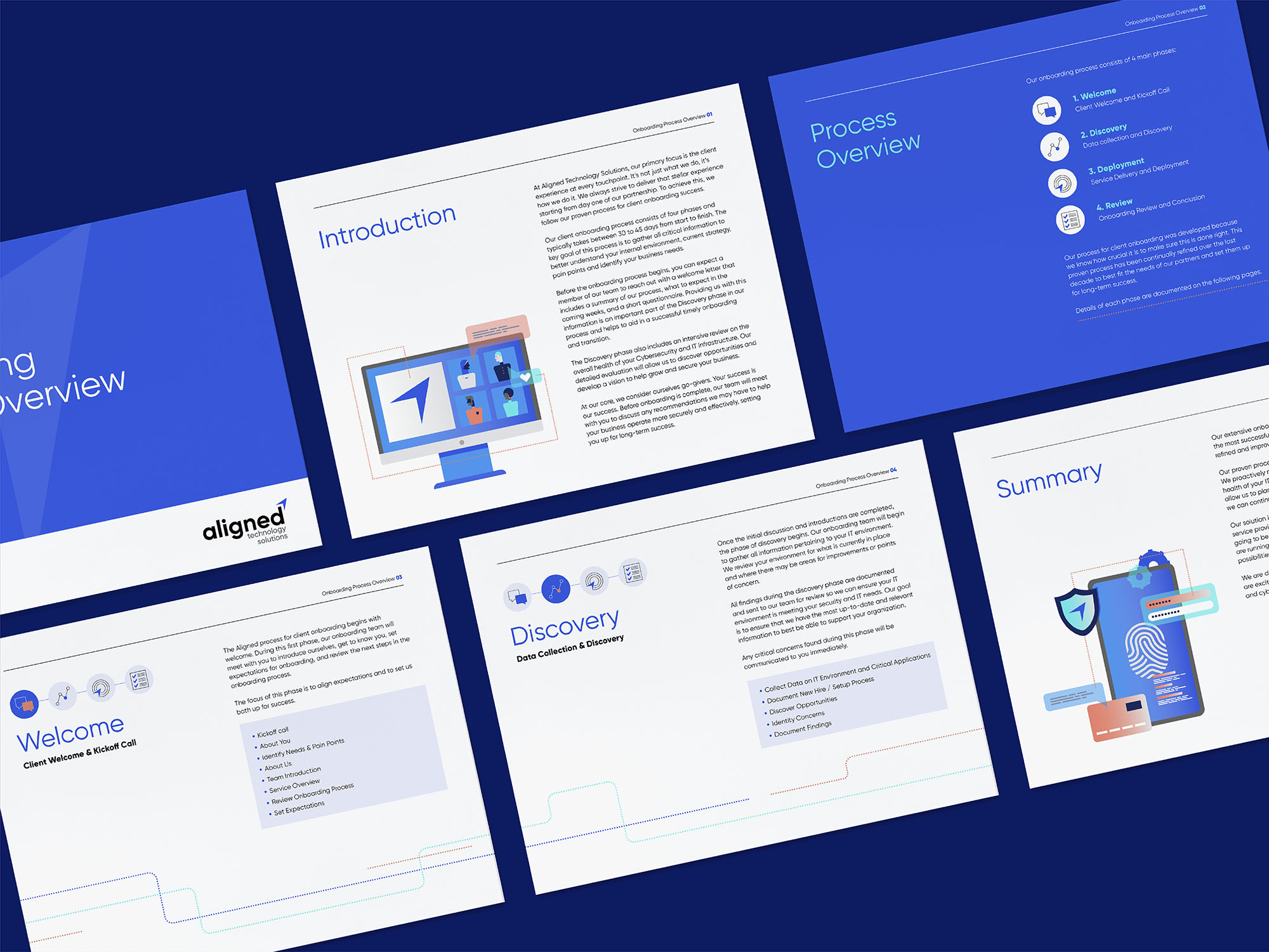
Alongside updated typography and colors, several custom graphics were illustrated as a part of Aligned's visual system. Integrating these across the website helps set Align apart, as most of their competition uses stock photos as their primary visual aid.
The deliverables:
In order to accomplish Aligned's rebranding, the following activities were pursued:
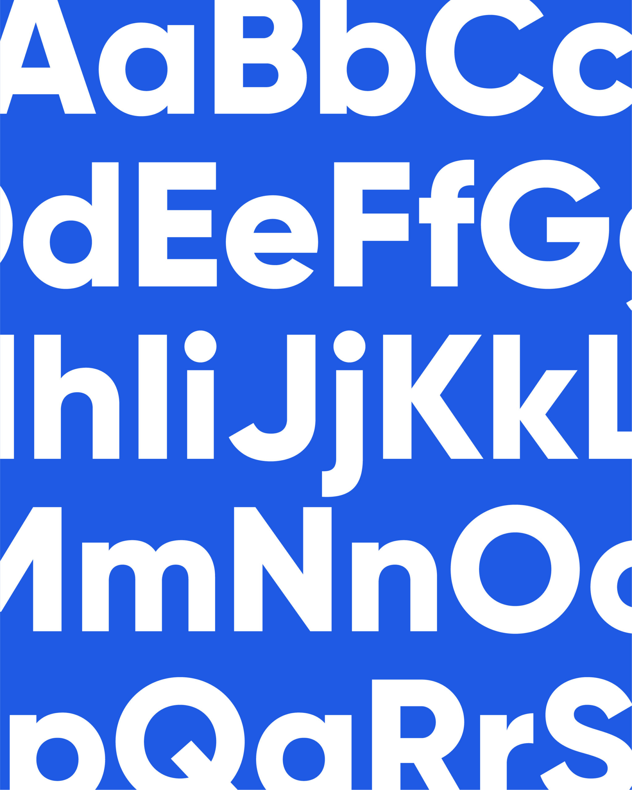
Visual identity creation: Developing a visual identity that included a new logo, brand guide, colors, typography, icons, and custom graphics.
Web design and development: Redesigning, redeveloping, and relaunching the Aligned Technology Solutions website to be aligned with the new visual identity. Ensuring the website met 508 compliance standards in its design, including colors and form accessibility and legibility for screen readers.
Print and digital collateral: Creating various promotional print collateral such as business cards and brochures, building templated pitch decks, and developing graphics for email and social campaigns.
See the full Aligned Technology Solutions site here.
